
How to Make a Premium Interior Feel Calm, Not Showy: 3 Decisions That Change Everything
A premium interior doesn’t need to perform luxury at full volume. In fact, the most convincing spaces usually do the opposite: they edit themselves. Instead of piling on finishes, statement pieces, and dramatic gestures, they rely on restraint, atmosphere, and a sense of order that feels effortless to live with.
That shift matters more than ever. A recent Architectural Digest piece on quiet interiors described a growing appetite for spaces that feel comforting and emotionally grounding rather than visually loud. Research points in the same direction. A 2024 systematic review and meta-analysis on light and wellbeing found a small-to-moderate positive effect of light on wellbeing, with a pooled effect size of 0.46 and a robust sensitivity result of 0.53. In other words, calm is not just a style preference. It is part of how a space supports everyday life.
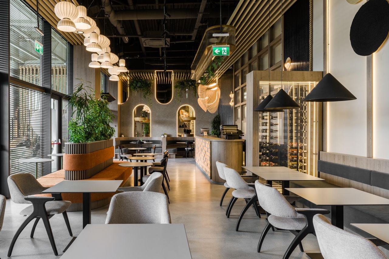
When a premium interior feels calm instead of showy, three things are usually happening at once: the material palette is edited, the lighting is layered, and the spatial rhythm is easy to read. That logic comes through clearly in three MiMa Design projects: The Wok, Adrett Beauty-Med, and an apartment on Strada Gimnasticii.
1. Use fewer visual moves, but make each one count
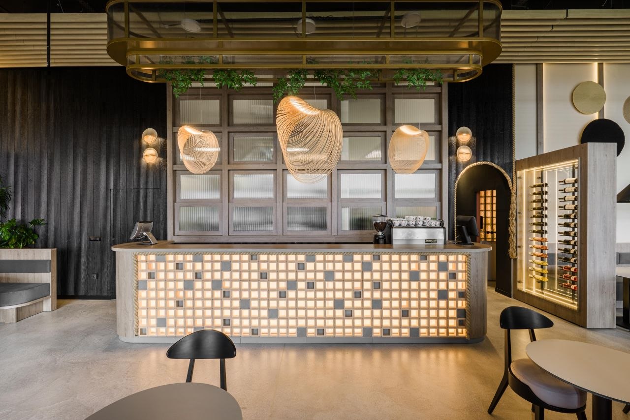
Understated luxury starts with discipline. The goal is not to remove richness, but to concentrate it. At The Wok, the impression of quality comes from a carefully limited dialogue between pale timber, darker ribbed wall surfaces, softly reflective metals, and frosted glass. Nothing is there just to add noise. Each finish supports the others.
That is what separates a premium interior from a merely expensive-looking one. In a weaker scheme, every zone tries to become the focal point. In a stronger one, materials work as a team. One surface introduces warmth, another gives structure, another catches light quietly. The room feels composed because the palette has been edited before it was decorated.
There is also a perceptual reason this matters. Research on wall texture and perceived spaciousness suggests that material texture influences how people read interior space. Texture is not only decorative; it changes the way scale and comfort are experienced. When too many strong surfaces compete at once, the room can feel fragmented. When textures are coordinated and paced, the interior feels calmer and more assured.
2. Treat lighting as atmosphere, not as a special effect
Lighting is often the difference between a polished interior and one that feels truly refined. Many spaces have good finishes but lose their composure because the lighting is either too flat or too theatrical. Both mistakes work against calm. Good lighting should guide the eye, support the materials, and make circulation feel intuitive.
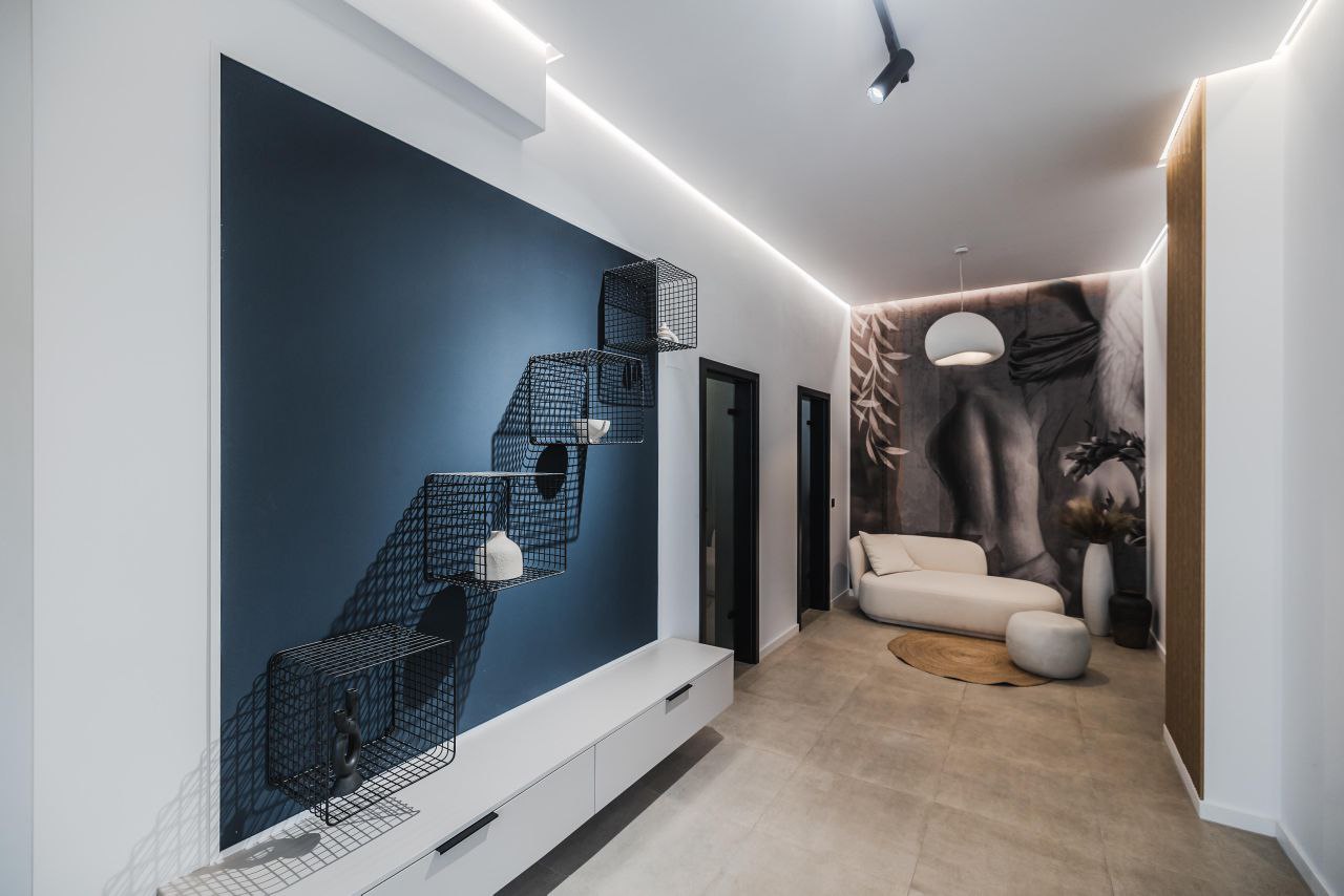
That is exactly what happens in the Adrett Beauty-Med transition space. The mood is built through discreet perimeter lighting, selective accents, and a well-managed contrast level. The corridor does not read as leftover space; it becomes part of the brand experience. It feels measured, quiet, and intentional.
The research case for this is strong enough to matter in practice. The wellbeing meta-analysis above reinforces that light design affects more than appearance, while studies on daylight at home connect better light exposure to circadian alignment, sleep, and mood. For designers, that means a premium interior should not only look good in a photograph. It should regulate experience over time.
The most effective solution is layered lighting: a solid ambient base, targeted accent light where it is useful, and a color temperature that flatters materials instead of bleaching them. When lighting is structured like this, the space feels more expensive precisely because it feels easier on the nervous system.
3. Build spatial rhythm before adding detail
The final decision is less flashy, but arguably the most important: spatial order. Calm premium interiors are easy to read. You understand where one function ends and another begins. Furniture placement feels intentional. Circulation has breathing room. Decorative choices land better because the underlying layout is already coherent.
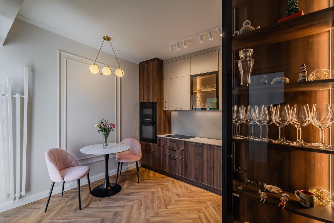
In the Gimnasticii apartment, the integrated dining area works because it has a clear internal rhythm. The table, pendant, glass cabinet, and storage volumes do not fight for dominance. Together they define a compact but complete zone. The result is elegant not because it is oversized, but because it feels settled.
This is where many residential interiors miss the point. Luxury is not only a matter of square footage or premium finishes. It is also a matter of legibility. When the plan is clear and the proportions are balanced, the space can feel generous even when it is relatively small. That sense of calm legibility is what turns a room from simply well-furnished into quietly premium.
The best interiors often leave the least to explain. Once spatial rhythm is in place, materials and lighting can do their job without overcompensating. Without that structure, even beautiful details can feel like decoration applied after the fact.
Conclusion
Premium interiors age well when they do not rely on spectacle. The Wok demonstrates the strength of a tightly controlled material story. Adrett Beauty-Med shows how layered lighting can soften and elevate a transition zone. The Gimnasticii apartment proves that order and proportion can create real elegance in a compact footprint.
Ultimately, the most durable kind of luxury is edited luxury. Not less ambition—just better choices, working together. That is what allows a space to feel memorable, livable, and calm all at once.
