
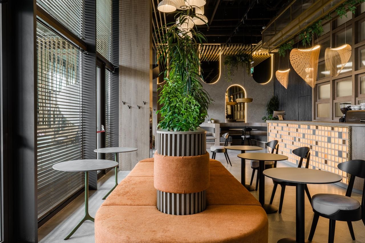
How to Avoid a Clinical Look in an Elegant Interior: Matte Surfaces, Controlled Reflections and Warm Light
Many well-finished interiors lose the very emotion they are trying to create. They have good materials, enough order and plenty of light — yet they still feel cold, flat or slightly clinical. The issue is rarely the budget and not necessarily a lack of decoration. More often, it is the way surfaces respond to light. If everything reflects in the same way, if every area is lit evenly, or if texture has no real relief, the space may look correct without feeling memorable.
In MiMa Design projects, the difference often comes from a very specific trio: mostly matte surfaces, a few controlled reflections and warm light placed with intention. A study published in the International Journal of Environmental Research and Public Health found that wall texture influences perceived spaciousness, while a recent meta-analysis on light and wellbeing reported a small-to-moderate positive effect of light on wellbeing. In other words, materials and lighting do not just change the photo — they change the way people physically read the atmosphere.
The three examples below show how to create depth without slipping into either sterile or overloaded.
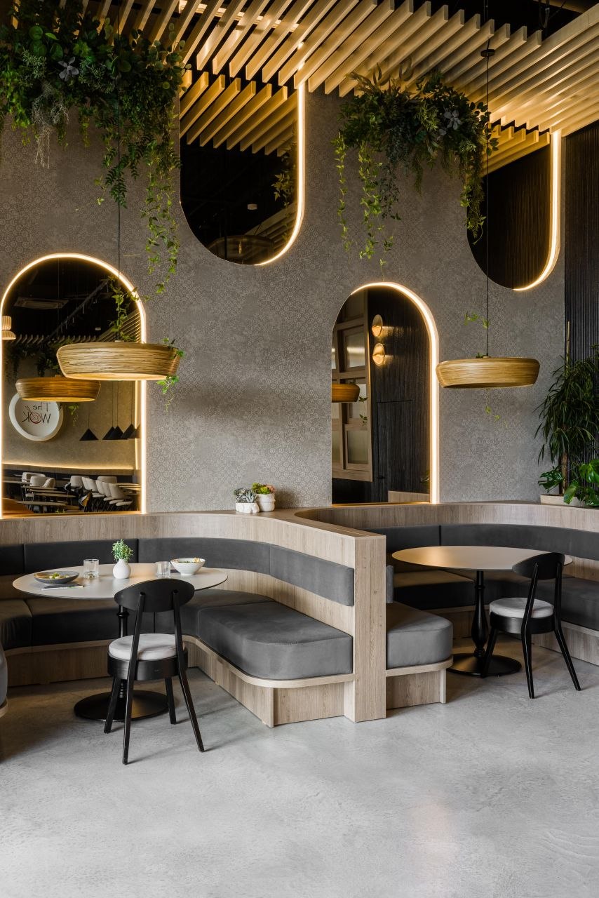
1. The Wok: the drama comes from finish contrast, not from making every surface glossy
In the banquette area at The Wok, the atmosphere does not rely on aggressive shine, but on dosage. Pale wood, deep-toned upholstery and textured walls absorb and filter light differently, so the room gains layering without feeling busy. The illuminated arches and suspended fixtures add warm accents, but they do not turn the scene into a showcase of reflections.
The matte surfaces do most of the heavy lifting here. The tables, upholstery and vertical finishes create a calm base, while reflections appear only where they genuinely help the composition — at the mirror edges, in filtered light and in a few metal details. When the eye sees a real difference between absorption and reflection, the room gains depth. When everything is glossy — or, at the other extreme, when everything is equally inert — the result becomes either tiring or flat.
There is another important move here: the warm light is localized. The U.S. Department of Energy notes that LEDs allow better directional control, which matters enormously in accent lighting. In a hospitality project, that control is what separates a composed atmosphere from one that simply feels very bright. At The Wok, warm light does not soften the room for its own sake; it builds hierarchy and keeps the interior away from a clinical feel.
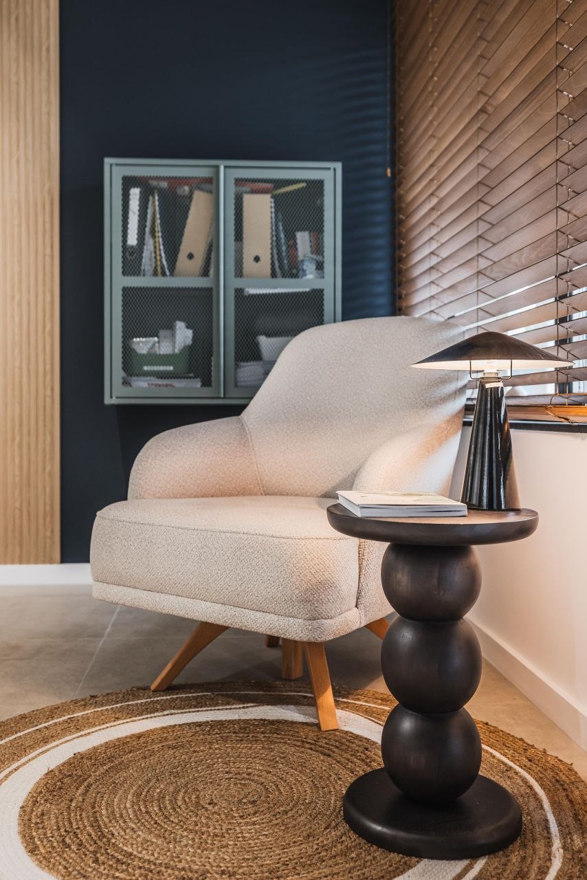
2. Adrett: a beauty space stays warm when texture breaks visual uniformity
Beauty interiors often face a familiar problem: if they lean too heavily on white, smooth finishes and evenly distributed light, they can slide into a clinical atmosphere. In this Adrett waiting corner, MiMa avoids that trap. The upholstery, the visible fiber of the round rug, the wooden blinds and the deep-toned wall all create a dialogue between surfaces that do not behave in the same way.
Here, controlled reflection means nothing shines without purpose. The table lamp and the daylight filtered through the blinds introduce small, warm highlights — just enough to animate the composition. The rest of the materials stay mostly matte or softly satin, which makes the space feel tactile and calm rather than sterile. The wall-texture study shows that reflectivity, texture direction and depth strongly influence the way people perceive space. In practice, that means texture is not ornament; it is a compositional tool that interrupts the monotony of uniform light.
Adrett is also a good reminder that not every elegant interior needs high color contrast. Sometimes it is enough for materials to react differently to the same light. That difference is what creates warmth and refinement.
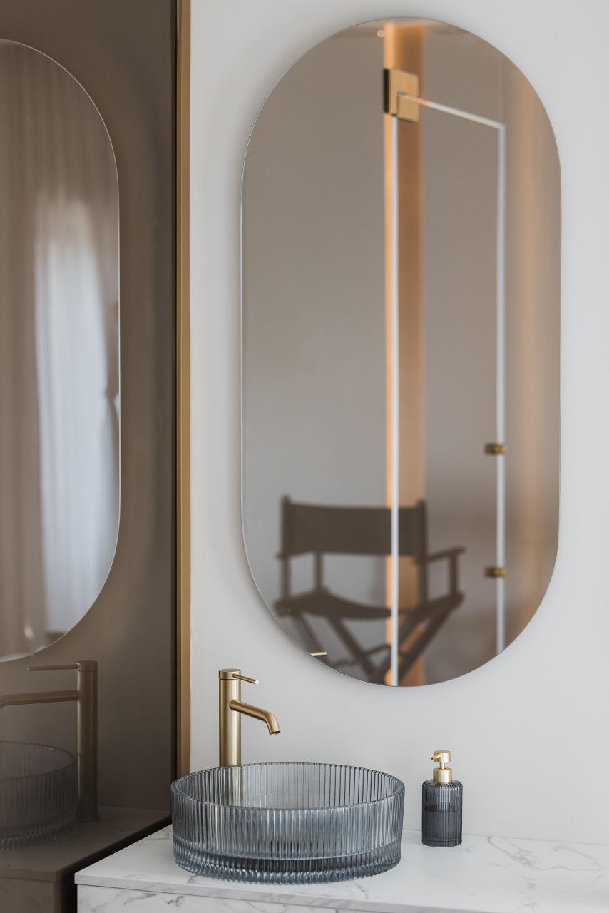
3. Belle Studio: the best reflections are few, but precise
The bathroom at Belle Studio makes the difference between clean and clinical very clear. The composition is airy, but not cold, because the reflections are tightly controlled. The fluted-glass basin does not give back a hard glossy image; it diffuses it. The warm satin tap responds gently to light. The pale countertop and the rest of the surfaces maintain a calm base without harsh shine.
This matters even more in smaller rooms, where every aggressive reflection is immediately noticeable. If you have too many hard finishes and too much frontal light, the room feels sterile. If you use only fully matte materials and weak lighting, the space goes dull. At Belle Studio, the balance comes from alternation: matte, satin, translucent, then matte again.
The meta-analysis on light and wellbeing shows that the effect of light depends on intensity, duration and context. In interior design, the translation is simple: good light is not just more lumens, but light that suits the materials it touches. At Belle, warm light and soft reflections keep the room crisp without making it cold.
Practical checklist: how to avoid an elegant interior that still feels too cold
If you want a quick way to test whether a scheme risks feeling clinical or flat, check these five things:
- you have a base of matte surfaces that absorb part of the light;
- reflections appear only on a few key materials, not everywhere;
- warm light is directed toward the areas you actually want to emphasize;
- textures remain legible both up close and from a distance;
- you are not treating every corner with the same lighting intensity.
In MiMa Design projects, elegance rarely comes from one spectacular gesture. More often, it comes from the way matte materials, measured reflections and warm light support one another. When that relationship is controlled well, the space stays clear and refined without tipping into either sterile or bland.
